Design Analysis
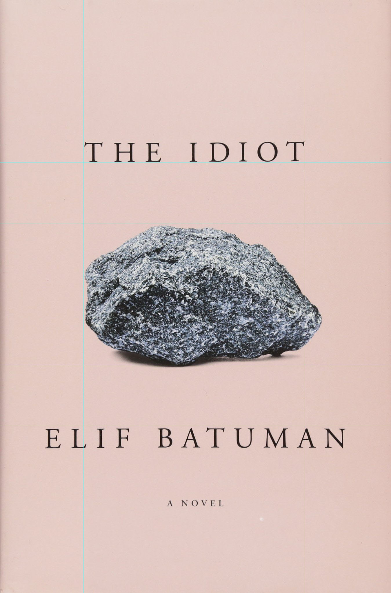
Here is the book cover for The Idiot by Elif Batuman.
Note how all text on the book cover uses the same font, Garamond. This consistency in typeface creates a minimalist look that shines light on the title and author of the book.
The cover efficiently uses the grid system to position its elements. All texts and graphics are centered on the page, and the two text elements on the top and the bottom are equidistant from the single image of the rock in the middle. The placement also emphasizes the visual metaphor of the “idiot” and the rock.
Lastly, the graphic uses a simple color palette to convey its main message without clutter. The pastel color tones also create a modern look that would be appealing to potential readers.


